
Understand the Importance of a Mobile Optimized Website
In Brazil, over 155 million people aged 10 and older own a mobile phone for personal use according to IBGE. This represents almost 85% of the population from that age onward. Moreover, according to Pnad, smartphones are the most used devices by Brazilians to access the internet, surpassing laptops and desktops, for example.
Considering this data, it’s easy to understand the importance of having a mobile-optimized website, right? As mobile phones are increasingly used to access web pages, search on Google, and check social media, it becomes essential to create responsive websites. This way, the content is presented in an optimized manner, improving user experience and the page's reach.

Why is it Important to Have a Mobile Optimized Website?
As we have seen, the number of people using mobile phones to access the internet is growing. This is a trend that is expected to expand in the coming years. Keeping this in mind, companies need a mobile-optimized website to facilitate mobile access, making it one of the most important strategies in digital marketing. This positively impacts user experience, improves page reach, and consequently increases conversion chances.
Since a large portion of Brazilians access the internet via their mobile browsers, websites must be responsive to ensure a good experience for visitors. Otherwise, within seconds, they will leave the site, increasing the bounce rate. And, as we know, this negatively impacts the site's performance on the internet. Furthermore, not having a mobile-optimized website signals neglect towards visitors, as we know that Brazilians use their devices for internet searches.
In other words, when visiting a website, the visitor expects to access content in a simple and efficient way. Within seconds, they need to find the answer to what they were searching for, directly impacting their experience. If everything flows correctly, the likelihood of them accessing other pages on the site, increasing their time spent and engagement, is high.
You might be interested in: Google Ads: everything you need to know about the advertising platform
Your Website Can Be Penalized by Google
Did you know that a non-optimized website can be penalized by Google? That's right!
Since Google understands the importance of optimization due to the frequent use of smartphones for internet access, its algorithms have favored mobile-optimized websites since 2015. This means that pages without responsive or optimized versions have lower relevance for Google, resulting in reduced visibility in organic search results for keywords.
According to Google itself, when accessing a website, visitors expect to resolve their doubts quickly. Therefore, mobile-optimized websites need to offer simple and fluid navigation so that users can find what they are looking for. You wouldn’t want to lose ranking because you don’t have an optimized website, would you? So stay alert!
How to Know if Your Company’s Website is Optimized?
A very simple tip to test your website's optimization is to open it in your mobile browser. Preferably, use your mobile data network to perform the test. If it takes a long time to load, opens in a disproportionate format, or hides important information, know that the site is not optimized. Therefore, it’s necessary to raise a red flag and seek to resolve this issue as quickly as possible.
A quick and efficient option to check if your site is ready to be accessed via mobile device is to perform the Google Mobile-Friendly Test by clicking here. This test is interesting because, in addition to informing about responsiveness, it detects errors that may be compromising this optimization. Among them can be clickable elements that are too close together or even text that is too small for reading on mobile devices.
5 Tips for a Mobile Optimized Website
1. Observe Responsive Design
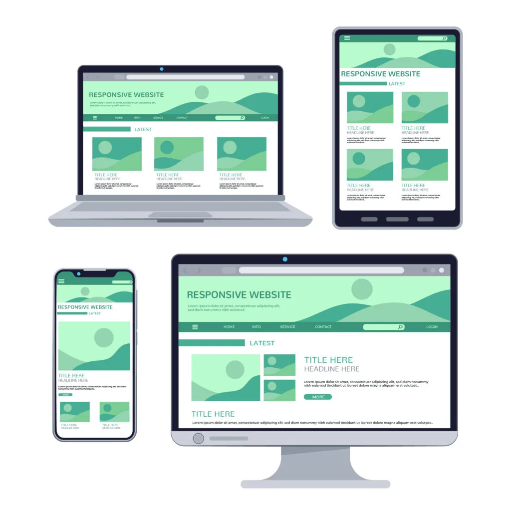
The first step for a mobile-optimized website is to ensure its design is responsive. That is, responsive design is one that automatically adapts the website's appearance to the screen format it is being opened on. Thus, when opening the site on a mobile phone, the layout will be 100% suitable for the device's screen format, without hiding information or altering images, for example. This is essential for a good visitor experience and helps reduce the bounce rate.
2. Page Loading Speed
An important factor in a mobile-optimized website is the loading speed of the pages. This is why it’s important to test them using 3G or 4G networks. Very slow websites are penalized by Google and lose ranking in organic search. If your site is very slow, taking a long time to load images, it’s necessary to change the image sizes, avoiding very large files. In some cases, it may be advisable to make changes to the page layout itself to optimize loading.
3. Simplified Navigation
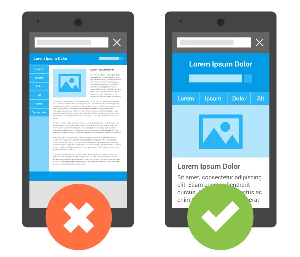
One of the most relevant points for Google is simplified navigation. That is, due to the smaller screen size, the website needs to be adapted accordingly to facilitate use. For example, the text cannot have small fonts that hinder reading. The visitor needs to quickly find buttons to access what they want, as well as locate the menu and tabs. Therefore, use appropriately sized resources so that it is not necessary to zoom in on the page to read its information.
4. Adapted Content
Not only the images on the mobile-optimized website need to be responsive. The rest of the content, including texts and videos, must also be suitable for display on mobile devices. To do this, it is advisable to check all the content published on the pages and adapt the display format for smaller screens. To achieve this, rely on an agency specialized in website creation and optimization.
5. Ease of Performing Actions
Another fundamental detail in a mobile-optimized website is the ease it offers for visitors to perform actions. Everything needs to be simple and intuitive. In other words, when viewing a product, they need to quickly find the purchase option so that the transaction can be completed quickly and efficiently. In addition to improving user experience, this directly influences conversion rates and the company's profitability.
Important Details in Responsive Layout
When creating a mobile-optimized website, it’s important to pay attention to some details. It’s not enough to just adjust the page format for display on mobile device screens. As we know, mobile phones have small screens, only a few inches. Therefore, it’s also important to adjust the size of media and text fonts. This will ensure a better experience for the user, allowing them to read all content comfortably and accessibly.
Formats of Mobile Optimized Websites
When we talk about mobile-optimized websites, we commonly think of responsive sites. After all, this is the most used model, following Google's recommendation. However, besides the responsive design website, there are two other modalities: dynamic serving websites and separate URLs. However, these two require more effort to improve optimization with search engines.
In all cases, there are common rules that must be evaluated when optimizing the site for mobile devices. Everything should be based, first and foremost, on user experience. After all, we know that search engines like Google have the ability to identify responsive sites. In the case of those that are not, due to harming the visitor's experience, they lose position in search results.
It’s important that the search engine, whether Google, Yahoo!, Bing, or others, is aware of the existence of a mobile-adapted version of your site. In the case of sites with separate URLs or Dynamic Serving, it’s necessary to configure the server and also the URLs according to the types of mobile devices. Therefore, it’s essential to have specialized professionals to carry out this configuration properly.
Take the opportunity to read: 5 Reasons to Have a Blog on Your Company’s Website
Difference Between Mobile Site and Responsive Site
It’s important to differentiate a mobile site from a responsive site, as although the terms may confuse, they refer to distinct solutions. A mobile site is a site created exclusively for access on mobile devices. In other words, its programming can identify the type of device trying to access it and, upon determining if it’s an iPhone, Android, tablet, or iPad, automatically adapts to the screen format.
On the other hand, a responsive site, as we saw earlier, is one that can adapt to any device trying to access it. Whether it’s a mobile phone, an iPad, or even a laptop or desktop computer. Thus, regardless of the type of screen, whether desktop or mobile device, it will be able to adjust its elements to fit the format in question without compromising the visitor's experience.
Why Does Google Prefer Responsive Sites?
Now that you know what a mobile-optimized website is, let’s explain why Google prefers this version of sites. In fact, the answer to this has been addressed throughout this article. But in summary, we can say that sites adjustable to different screen formats are more user-friendly. This allows for simplified navigation and improves the time visitors spend on the page. Thus, responsive sites are prioritized in organic results.

Responsive Sites Have Better Ranking on Google
We have already discussed Google’s preference for responsive sites – or rather, mobile-optimized sites. Precisely because they are more user-friendly and easier to navigate, Google understands that responsive sites can achieve a longer time of visitor retention.
Considering that a large portion of searches on the search engine occurs via smartphones, it’s only fair that mobile-optimized sites appear in the top positions, right? After all, just like any other company, ensuring a good user experience is also a focus for Google.
Engagement with the Persona
With a mobile-optimized website up and running, any time is a good time to reach a business's persona. This is because, from a mobile phone, anywhere and anytime of the day, the site can be shown to the ideal customer during a Google search.
As we know, a brand that wants to reach its persona and be remembered needs to be available all the time for its audience. And a responsive site is the best way to achieve this, as people are increasingly using smartphones for absolutely everything in their lives. From work to leisure, the mobile phone is one of the most important tools today.
Increase Business Credibility and Reduce Bounce Rate
A responsive site conveys a good image to the public. And this is a fundamental detail for those who want to attract people's attention on the internet and establish themselves as a reference in their field. After all, if your company is not one of the top-ranked in Google results, it will certainly be one of your competitors.
Being well-ranked on Google is synonymous with credibility, and this automatically helps reduce bounce rates on the site. With a mobile-optimized website, navigation will be much friendlier and simplified, encouraging users to visit different pages.
Is Your Website Already Optimized for Mobile?
As we have seen so far, being well-ranked on Google is essential for companies that want to stand out in the digital world. Moreover, a responsive site fosters relationships with the target audience and facilitates navigation. Thus, visitors have a greater chance of browsing different pages of the site, getting to know the company better, and discovering all the products and services offered.
Therefore, we can say that a responsive site increases your company’s chances of conversion on the internet. So, there are no more excuses for not having a modern and mobile-optimized website. This is a fundamental step to stand out from the competition and secure the best positions in Google’s organic search.
Need a New Website for Your Company?
Here at Kaizen, we specialize in developing responsive websites for mobile devices. Count on our professionals to achieve the best results on the internet.
Want to know how to have a mobile-optimized website? Get in touch and learn more!